← Work
Product DesignPersonalizationML Collaboration 2021 - 2023

How KKBOX Found Its Story Against Spotify

A homepage redesign turned personalization into a story about knowing the listeners

Role Product & Project Lead
Markets 5+ markets in Asia; 10M+ active users
How KKBOX Found Its Story Against Spotify
01

The Old Narrative

By 2021, KKBOX had spent a decade building the dominant audio streaming platform across Taiwan, Hong Kong, Japan, and Southeast Asia with 10 million active users. But years of growing pressure from Spotify had made one thing clear: KKBOX needed a sharper story of its own.

The competitive threat wasn't just about catalog or price. It was about story. Spotify's pitch was global, algorithmic, and frictionless. KKBOX's had to be something different: local, contextual, and genuinely attuned to how people in this region actually live with music. The problem was that the product didn't reflect that story yet. The Homepage tab, the main screen every user saw first, looked the same for everyone. It was editorially curated by teams regionally but manually, surfacing what someone at the company thought was worth hearing. That's not a story about knowing your listener. That's a broadcast.

Retention was declining. Engagement on the homepage was flat. I initiated the revamp, and the first decision I made was to bring in the company's first dedicated user researcher. Before we changed anything about the product, we needed to understand what KKBOX actually meant to the people who used it.

KKBOX homepage before the redesign, showing editorial picks in every section
Every section on the old homepage was an editorial pick.
02

Insights for the New

After a seven-day diary study and in-depth interviews, we had an answer. And it reframed everything.

People were not looking for what's new. They were looking for audio that fit their life right now. A playlist for the commute. Something to focus to. A podcast for winding down. Whether it was a new release or something they had heard a hundred times did not really matter. What mattered was whether it matched the moment.

We also found a balance point for discovery. Users did not want a feed that was entirely familiar. That felt stale. But they did not want to be thrown into the unknown either. The sweet spot was roughly 80% familiar, 20% stretch. Enough recognition to feel like this knows me, enough novelty to keep things interesting.

This was KKBOX's actual competitive edge. Not catalog size. Not algorithm sophistication. The insight was about context: that a local platform, built by people who understood daily life in Taiwan and across the region, could build something Spotify's global machine was structurally worse at. Spotify knew what you liked. KKBOX could know when and why you needed it.

That became the principle behind the entire feed. We structured it to move from the most personal content at the top to progressively more exploratory as users scrolled down.

Feed architecture diagram showing content sequenced from familiar to exploratory
Feed structure: familiar at the top, exploratory toward the bottom.
03

Redesign for Stories

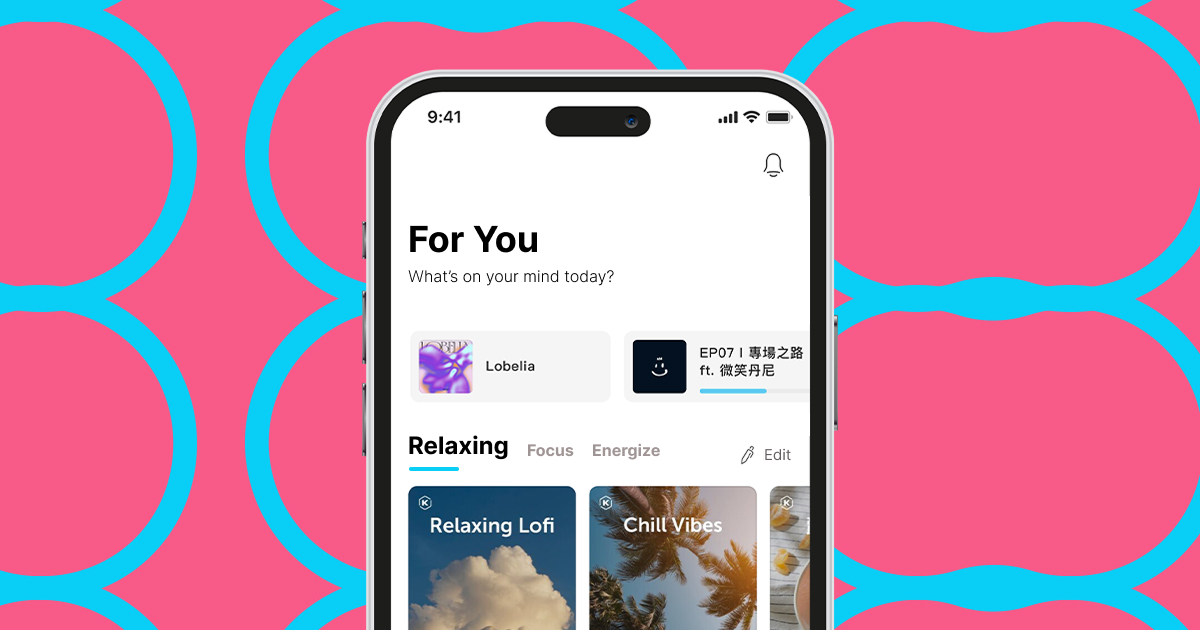
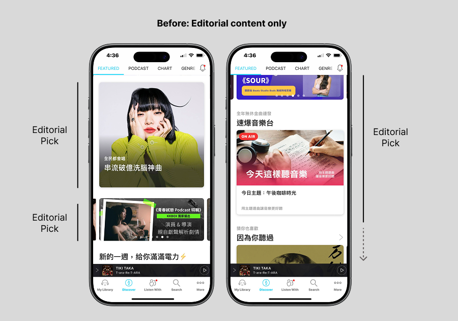
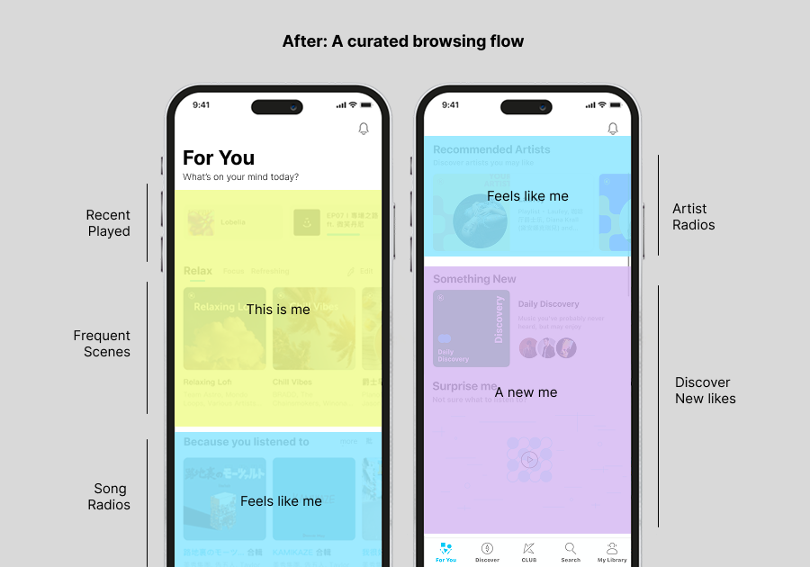
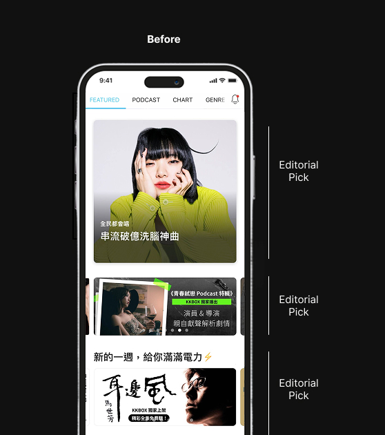
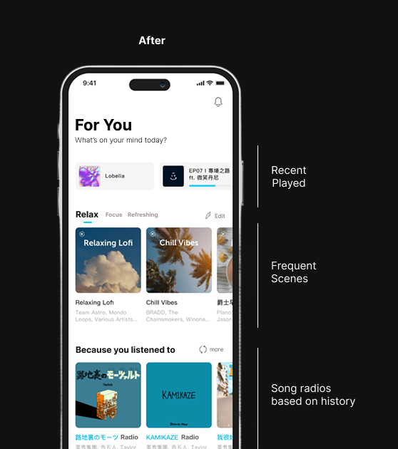
A Feed That Knew the Listener

The old homepage surfaced endless feed with what editors thought was worth hearing. The new one showed limited content what each listener's behavior suggested they'd care about. Recently played artists, similar taste playlists, followed podcasts.... For a product that had been editorially driven for a decade, this meant rethinking how every module on the page was sourced and ranked.

KKBOX homepage before redesign with editorial picks labeled
Before: one editorial feed for everyone.
KKBOX homepage after redesign with personalized modules labeled
After: personalized modules based on listening behavior.

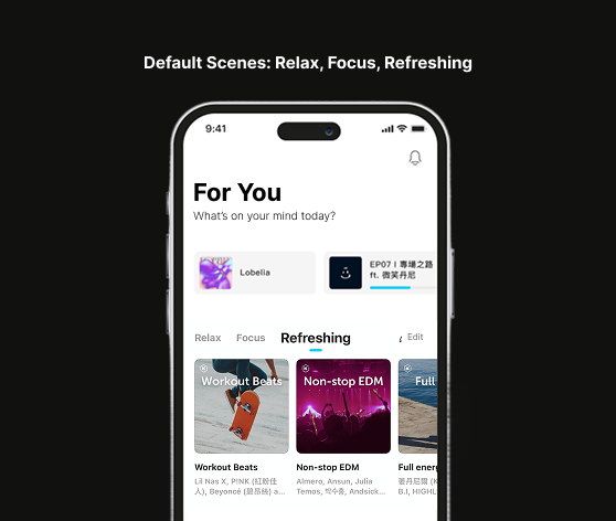
Your Scenes for the Moment

We created default popular listening scenes: Relax, Focus, and Refreshing, that grouped playlists around how users wanted to feel rather than what genre they preferred. Users could also create their own scenes to match their daily routines.

The design was intentionally simple. Someone who listens to different things before bed every night could build a scene for that and reach it in one tap. The point was to make the right audio easy to find in the moment you need it.

Default listening scenes showing Relax, Focus, and Refreshing tabs
A feature serves different moods and moments
Scenes area during a promotional campaign with artist-curated playlists
Artists made moments more engaging

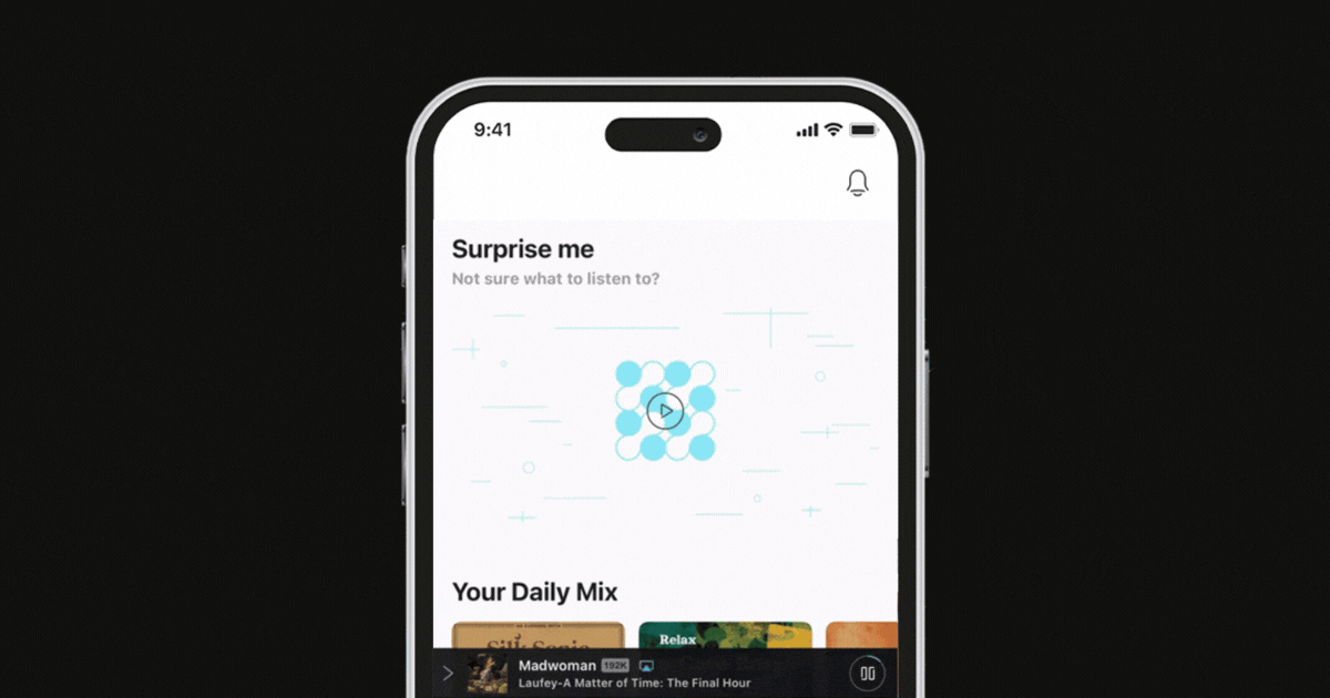
Turning Relevance into Choice

New AI personalized playlists powered by the recommendation algorithm were also built. These factored in listening patterns, time of day, recent behavior, and taste similarity. The goal was playlists that felt right for now, not just playlists that sounded like what you played last week.

One new feature, Surprise Picks, was introduced as a daily set of eight songs, mostly drawn from genres a user already loved, with a few picks deliberately one or two steps outside their usual range. A feature put the 80/20 principle into practice at the song level.

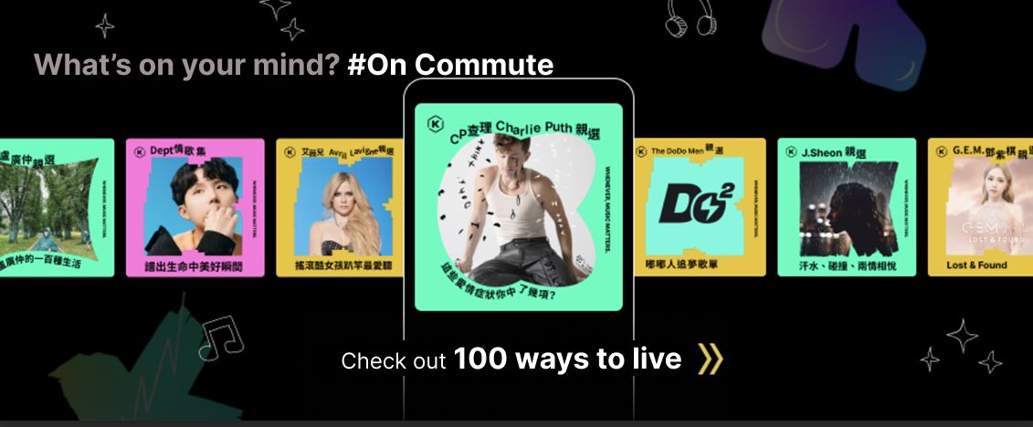
We also gave more visual cues throughout to help users identify interested contents on the feed. Instead of showing one playlist at a time, the new design displayed multiple cards side by side so users could scan and choose across options. Each card surfaced artists the user already followed or had saved in their library, signaling relevance before they even tapped in.

Surprise Picks feature showing randomized daily song recommendations
Surprise Picks: eight daily songs, mostly familiar, a few intentionally not.
04

Accomplishments

The metrics told one story. The more interesting one happened underneath them.

The Your Scenes feature, designed to help users find the right audio for the right moment became the company’s most effective promotional surface. Local artist collabs, yearly wrapped, seasonal campaigns, curated editorial moments: all of it fit naturally into a container that users already understood and trusted.

Things weren't designed for marketing became the best, when the underlying story was right.

81% to 95% Customer satisfaction Post-launch user survey
+2% Retention First quarter after launch
+5% Homepage play rate Users listening directly from the homepage
+38% AI playlist play rate Personalized playlists vs. previous editorial picks